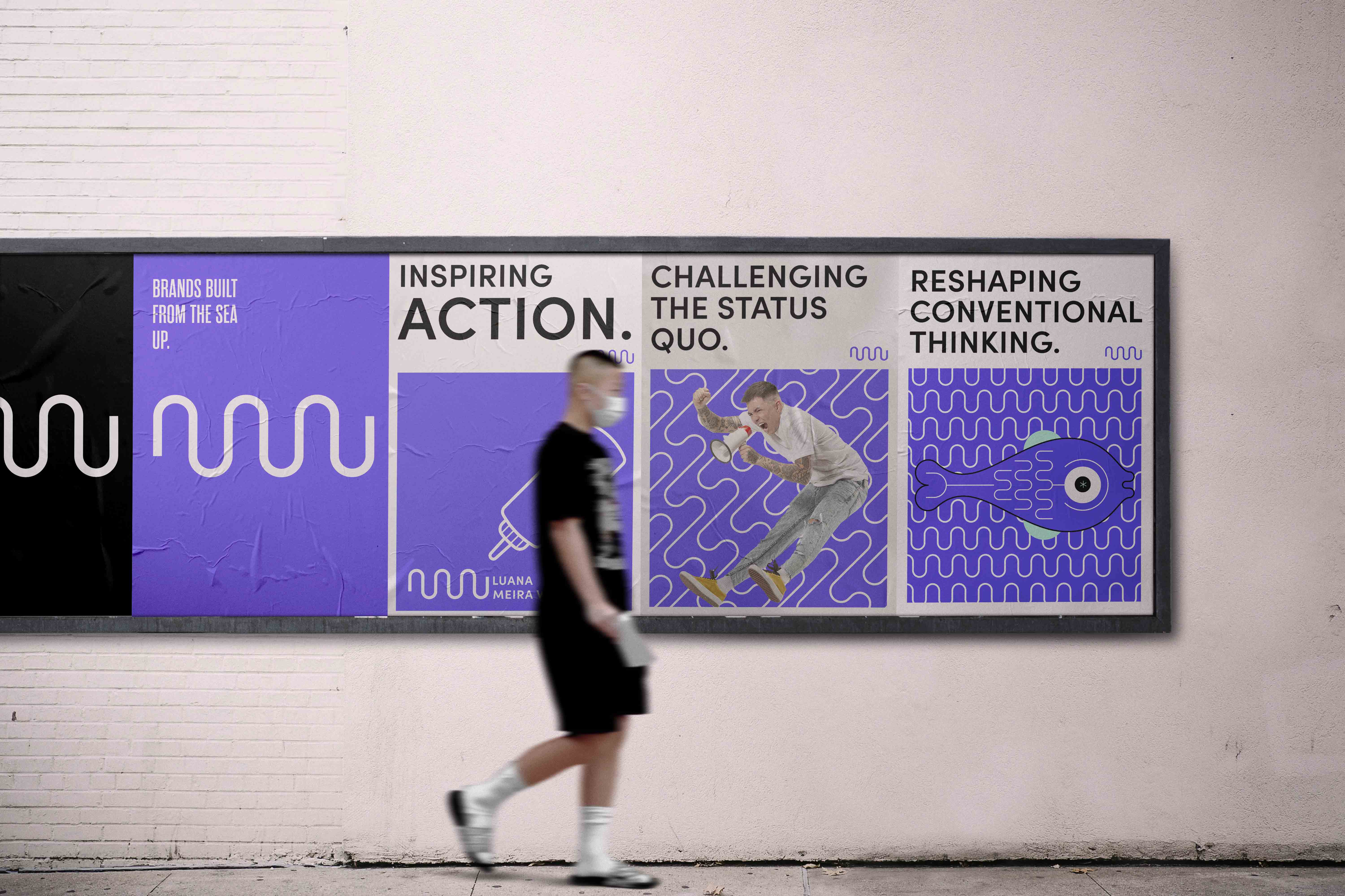
Just as the tide brings in fresh water, the logo mark represents an influx of fresh ideas. Moving from left to right, showcasing movement and progress into the future; The letters “M” and “W” are made to look like a wave, forming a symbol of movement and change.
I applied a wave-like shape in different formats and positions in order to define a strong and coherent identity.